Systems, Interaction, and Visual Design
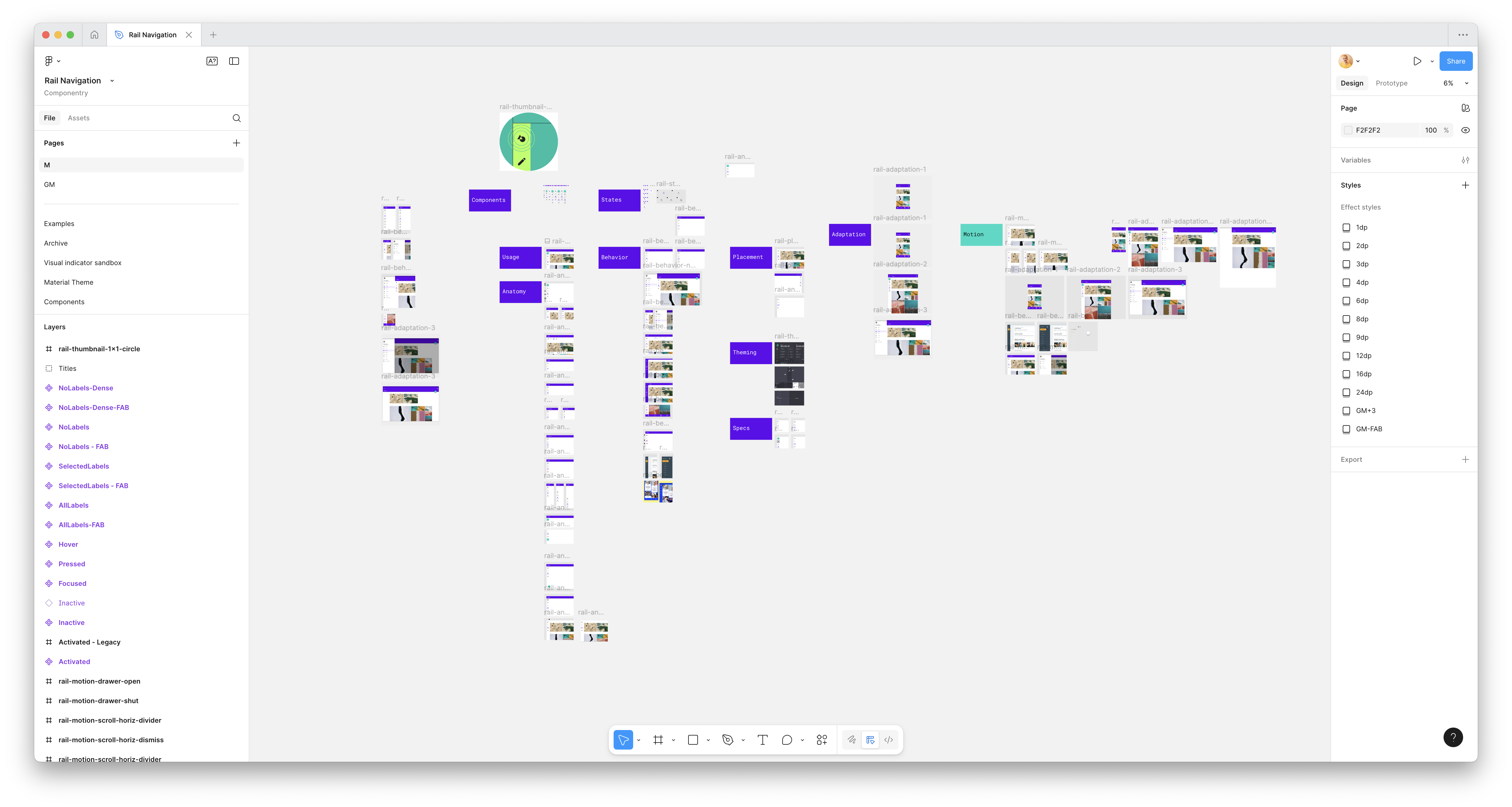
Material Design Navigation Suite
Overview
I led the design and integration of the Navigation Rail into the Material system. The navigation rail is a critical component bridging the gap between mobile (bottom nav) and desktop (nav drawer) interfaces. Following the initial launch, I directed the evolution of these components into the Adaptive Navigation Suite for Material 3 Expressive, allowing navigation to seamlessly adapt based on device posture and window size, helping users preserve context across form factors.

Impact
The navigation rail is a recommended best practice for Android. My specification directly influenced the creation of the NavigationSuiteScaffold in Jetpack Compose, enabling developers to implement adaptive navigation with a single code block.
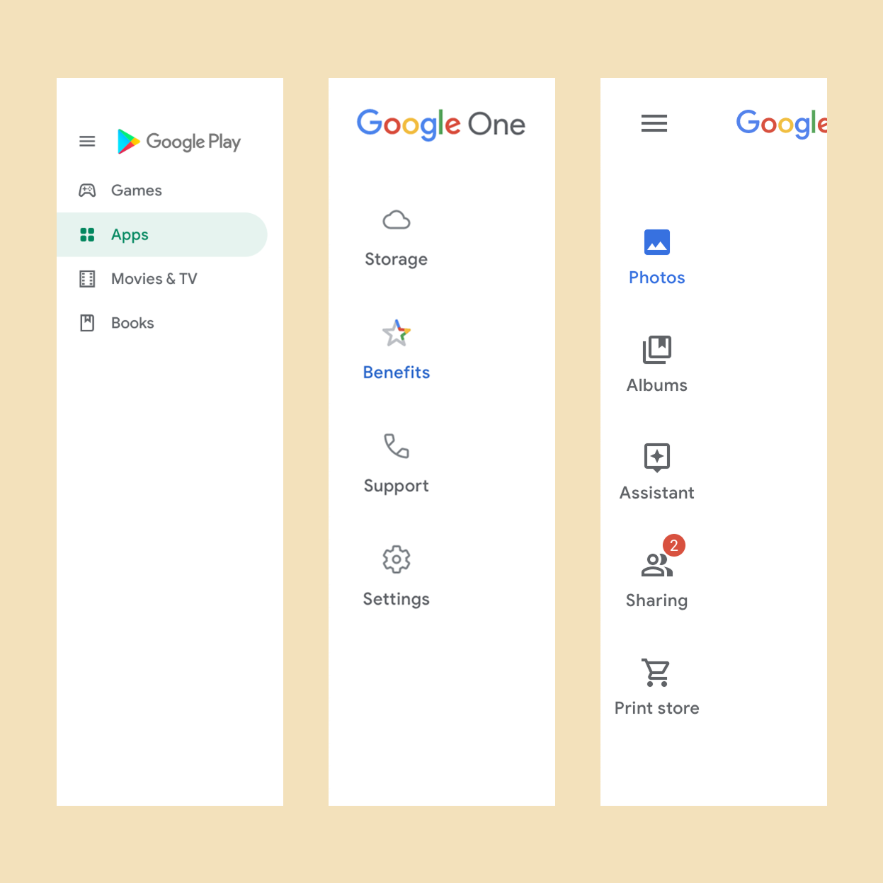
The pattern has been adopted globally by partners like Samsung (One UI), and SAP (Fiori), as well as core products like Gmail and Photos.
Discovery
Gaps and Opportunities
Through internal audits, we identified a breakdown in the responsive behavior of Google apps: while the Navigation Bar served mobile and the Navigation Drawer served desktop, "Medium" screens (eg tablets, landscape phones, foldables) had no optimized standard. Teams like Google Photos and Flights were creating inconsistent custom side-bars to fill this void. We needed a solution that maximized the vertical real estate of tablets without hiding top-level destinations behind a hamburger menu, ensuring users maintained their mental model of the app while resizing.
Process
Defining Constraints
While the Navigation Bar is limited to 5 destinations, I defined the Rail’s limit at 7 destinations. This decision balanced the increased feature density of larger screens with the cognitive load limits and vertical height constraints of the device.

FAB Integration
To acknowledge the legacy of primary actions placed in the top left of apps like Gmail (going back to the Kennedy design system pre-2014), I standardized the placement of the Floating Action Button at the top of the rail.
Together with Flutter engineering, I prototyped and discarded a bottom "cutout" variant for Google Material, discarding it to ensure the primary action remained prominent and consistent.
Visual Continuity
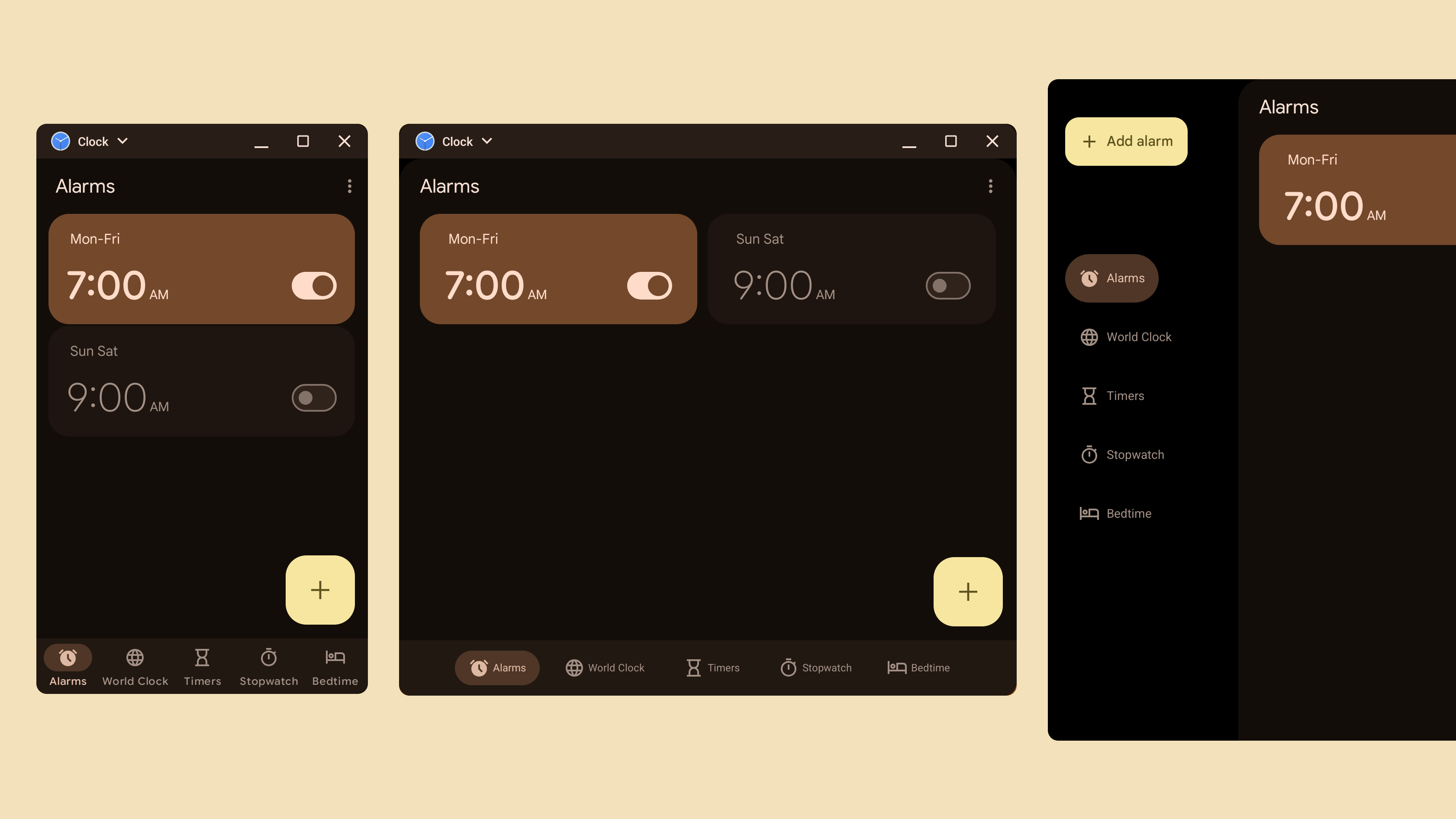
To avoid friction on transitioning between devices or screen sizes, we used a "nav-item" subcomponent across the navigation suite. This also meant that, as the user transitions, we don't need complicated animations; the icon and label remains familiar, preserving the meaning of the navigation items.

The design intent for the navigation rail was to “bridge the gap,” so it would be important to take into account the functionality and appearance of existing navigation components. I knew I wanted to create a component that carried forward the simplicity and easy access of the navigation bar while also leaving room to expand into the more fully-featured navigation drawer (or “hamburger menu”).

Suite Unification
In the second phase, for M3 Expressive, I unified the visual language of the navigation drawer to match the rail and navigation bar. We created a single adaptive system in which navigation is determined solely by user needs and window size.
Delivery
Design and code
I delivered the comprehensive navigation rail guidelines and specs, updated the Material Design Kit for Figma, and partnered with the Compose team to validate the NavigationSuiteScaffold APIs.
Navigation Rail
NavigationSuiteScaffold Documentation
Navigation Rail in SAP Fiori
Next Case Study
Adaptive Layout System
Designing for foldables and large screens.