Systems, Interaction, and Visual Design
Adaptive Layout System
Overview
To address the growing market of foldable devices and the existing ecosystem of Android tablets, I led the evolution of Material Design’s layout system from a rigid 12-column grid to a flexible, component-led adaptive model. This work bridged the gap between design intent and technical execution, providing a unified "encoded solution" for adaptive layouts.
Impact
By integrating these standards directly into Jetpack Compose, we standardized the UI logic for an ecosystem of 550 million active tablets and a foldable market projected to reach 100 million devices by 2027.
This system solved a critical "chicken-and-egg" resource problem for developers, lowering the barrier to entry and making adaptive layouts the default standard for Google’s first-party apps and third-party partners.
Discovery
Chicken and Egg
The previous Material grid system lacked a strong equivalent in code, forcing teams to "hack" responsive layouts. Through audits of 1P apps and UXR with external makers, I discovered that teams struggled to justify the high engineering effort required to build custom adaptive behaviors for non-mobile form factors. To solve this, we needed to move away from device-specific targeting and create a system that handled Android’s heavy fragmentation and free-windowing environments natively.
Process
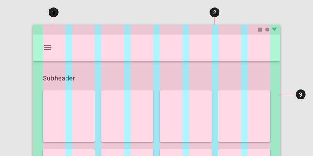
Layout Anatomy
To update the layout system, we started from components. The navigation suite, app bars, and common content patterns led us to divide the layout into distinct regions for each. Content is contained in panes, which behave and adapt like components of their own.


From Breakpoints to Classes
We moved away from pixel-perfect breakpoints to abstract Window Size Classes (Compact, Medium, Expanded). This decoupled layout logic from specific hardware, future-proofing apps for any screen ratio.
Canonical Layouts
Analyzing the most common patterns across top apps, we formalized the List-Detail, Feed, and Supporting Pane layouts. We experimented with a "Hero" layout but descoped it to prioritize the patterns that offered the highest utility to the widest range of apps.


Back to Componentry
I went beyond page layout, defining granular adaptive logic for a number of core system components (e.g., Button Groups hiding/stacking items based on available width) to ensure density was handled automatically.
Delivery
Specs, Guidelines, and Code
The final deliverables included the public-facing Adaptive Design Guidelines on material.io, updated Figma Design Kit assets with integrated adaptive frames, and reference code samples for the Canonical Layouts.
Material Adaptive Design
Figma Design Kit
Understanding Layout
Next Case Study

Adaptive Components
Enabling components to adapt to user needs.