Type Design, Graphic Design
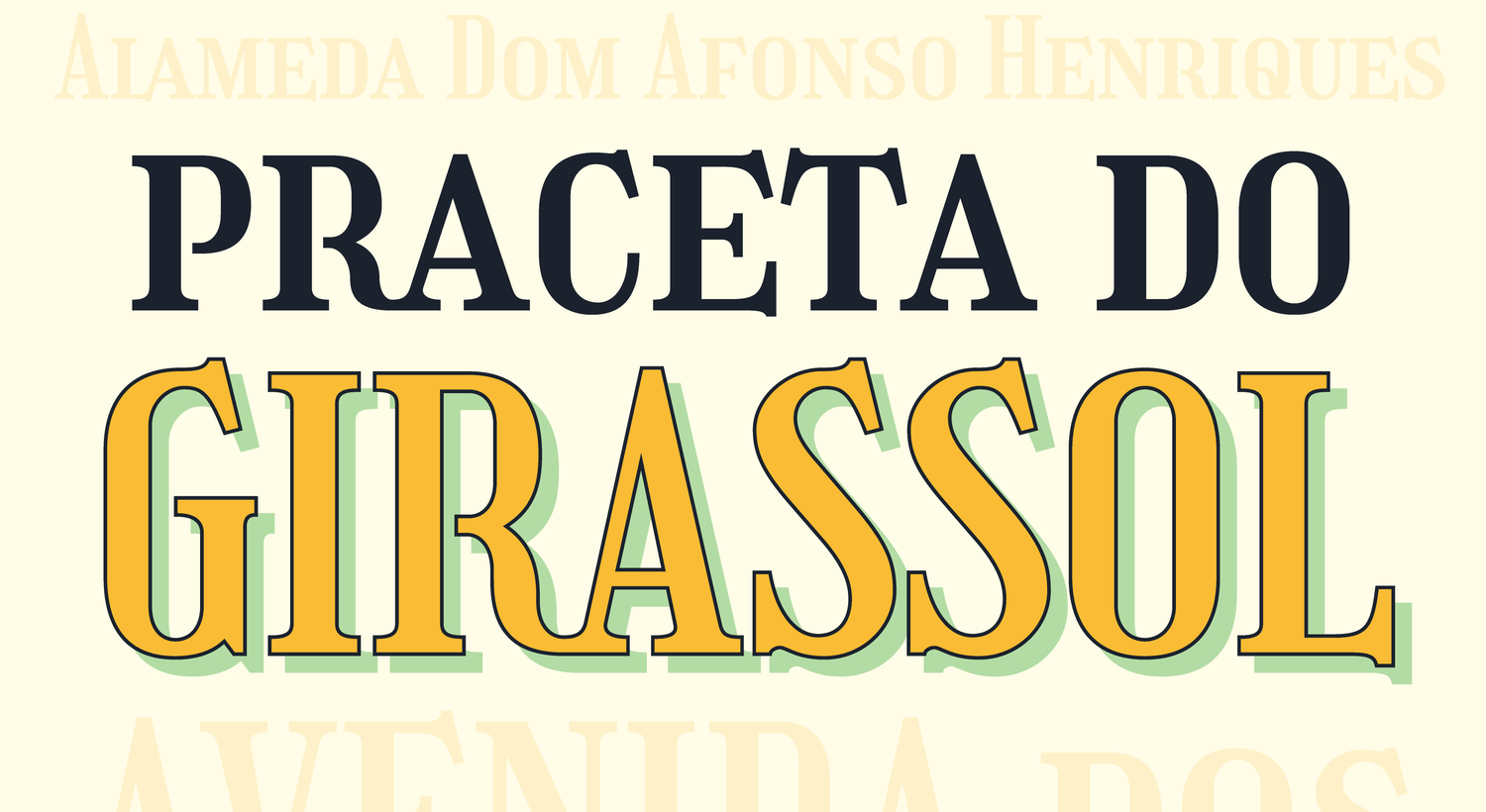
Girassol typeface
Overview
After completing the Extended Type@Cooper program at the Cooper Union in New York, I designed Girassol, a decorative typeface based on the hand-painted street signs in and around Carcavelos, Portugal. The typeface attempts to collect, synthesize, and lovingly evoke the identity and spirit of the region in which the original forms were encountered, while acknowledging my own relationship to and presence in the place and the design.
Impact
Girassol was a finalist for the Updike Prize and is included in the Updike Collection in Providence, Rhode Island. The typeface is served 1.2 million times a week by Google Fonts.
Discovery
Inspiration
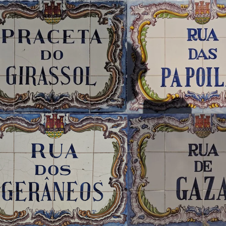
The inspiration for Girassol is hand-painted street signage in and around Carcavelos. The signs appear to be part of a larger family of hand-painted tiled signs in the region and elsewhere.
That said, the signs of Carcavelos maintain a unique local identity. This, I think, is because of their specific — and more recent — origin. From the reference photos I was able to collect during my time in Portugal in Summer 2019, it appears that Cerâmica Artística de Carcavelos painted many of the signs in the early-to-mid 1990’s (signs I encountered with dates appear to cluster around 1993–1995). From the reference photos and stylistic variations, it’s also clear that multiple artists (such as “VSV” and Isolde pictured above and “VL” below) painted the signs, not just because of the letters but because of the consistent frame motif and how it varies from place to place. As I collected more photos around the area, a sort of taxonomy started to emerge among the letterforms.
All the signs appear to be based on letterforms informed by Didone fonts, and most of them feature a combination of taller, more condensed forms with shorter, more regularly proportioned ones. Each lettering artist lends the signs a unique touch, whether it’s an R that’s giving a little extra kick, or something more extreme like the jutting, pointy serifs on Rua dos Gerâneos.
Design
Type System
In isolating the Carcavelos style and attempting to create a single artifact that paid homage to its unique personality, I had to make some decisions about which aspects of the lettering to adopt and which to adapt.
I loved the personality of the sharp serifs in GERÂNEOS, but couldn’t balance them consistently in a digital font. The serifs poked and prodded other letters, pushing them out of the way and creating enormous pockets of negative space.
On the other hand, the straight serifs in PRACETA spoke to me as a chance for an even, measured geometry that created clean boundaries around letters like E. Combining the two, after much experimentation, lead to forms that were expressive but still usable without the vivid, dynamic quality of paint on tile. Even the straightened lower serif is still allowed to dip below the baseline, giving it a thorny quality that isn’t distracting and doesn’t cause problems with spacing.
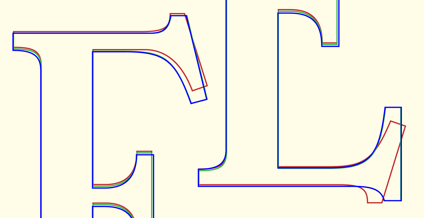
Creating a typeface inspired by these forms also meant unifying them—synthesizing a style that made it workable as a mathematic, digital system. This meant things like bringing the S into alignment with the proportions of other round letters in the family, straying from the wider S shapes in the signs while still allowing it to maintain its character.
This was tricky because it meant coaxing the S into a more strongly vertical orientation. The shifting serif shapes helped in this regard by giving the S a more stable foundation to stand on, without becoming too flat.
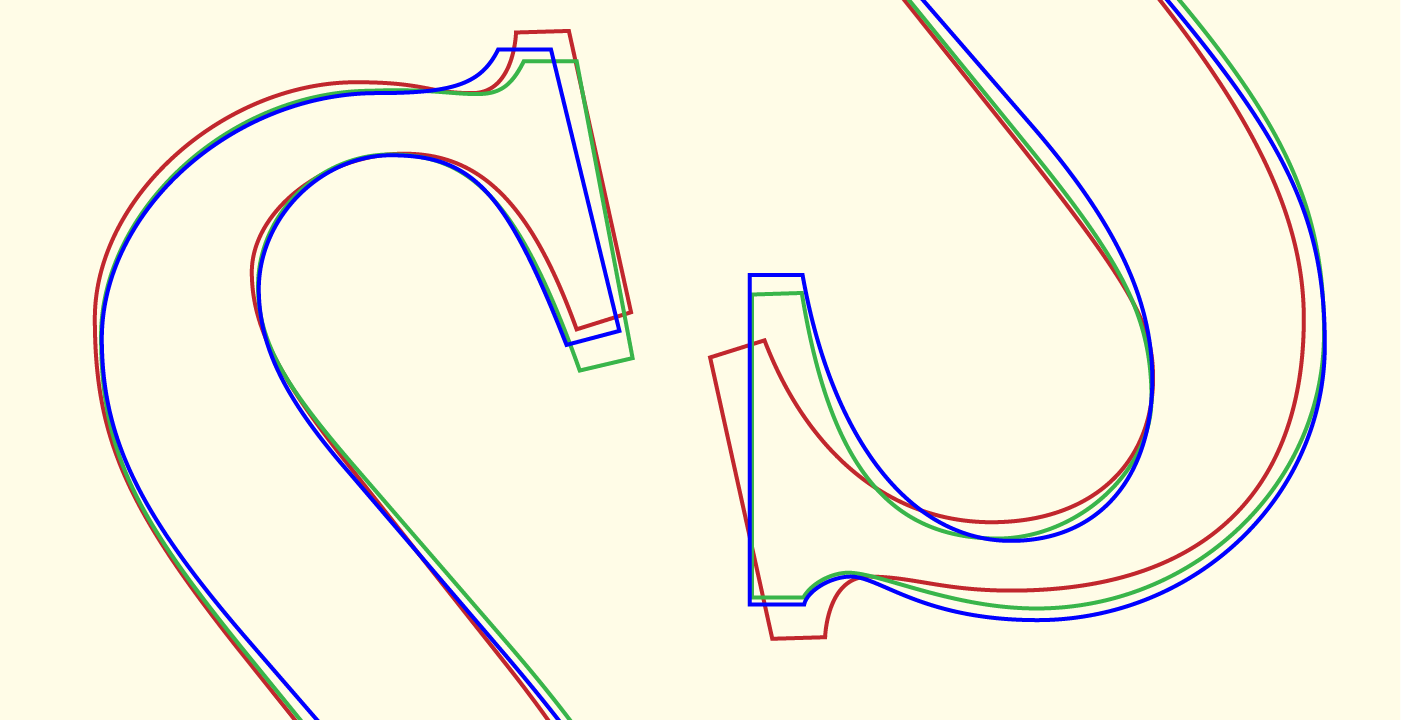
The typeface is highly decorative, but balances its strong ornamental characteristics to create something that feels both consistent and alive. Angled top serifs create a unifying rhythm, anchored by the straightened bottom and horizontal serifs in the design.

Personality
The primary characteristics that define Girassol include its condensed proportions, moderate contrast following the expansion model, a thorny, decorative serif construction that pierces the baseline and cap height, and playful flourishes like those on the R, J, K, Q, and figures that mimic the decoration possible in hand-painted signage.


Features
Numerous discretionary ligatures like E/A, L/A, T/E, R/R and T/T play on the typeface’s angular and thorny construction to evoke a sense of improvisation in the signs on which the forms are based.
A Personal Connection
Beyond the provenance of the letterforms, there’s something to be said for the origin of the project itself. The street signs above are all from an area I’ve visited multiple times now, when visiting my good friend Francisco Franco, an Android engineer I met back in my freelance days.
Over the years we’ve collaborated on several projects, and I first came to Portugal for his wedding. The signs have always enchanted me because of their handmade nature, the streets named for flowers, and the way they seem to celebrate what is often a completely utilitarian aspect of the built environment so joyously.
I associate these signs with the memories I have of the place, my friends, and my own life over the years that I’ve visited.
The result is a design that captures not just what I saw and my experiences of Carcavelos, but all the stuff surrounding them. All the things that couldn’t be explicitly unpacked are within the design, even as it directly references physical artifacts that aren’t my own.
Throughout the design process, I considered what it was that I was creating. A revival? An original work inspired by particular signage? Something else? In my first typeface for Type@Cooper, Wakehurst, I started the project thinking that I was doing a revival and came away feeling like the creative decisions necessary for digitizing a typeface from paper and ink made it something in-between but ultimately original. With Girassol, I never considered a literal process of translating the signs to type — what I wanted to convey with the project was the nature of the letters; their identities, attitudes, and role in the environment.
The way I encountered those artifacts and how I felt is contained here. The discretionary ligatures, the titling features, the unconventional shapes in the ampersand and double dagger are all expressive surfaces, proving again that type, for as much as it is design, is art.
Next Case Study
Adaptive Layout System
Designing for foldables and large screens.